


Reckless Booze Adverts Make a Mockery of DrinkAware Campaigns!
It’s surely not coincidental that the only part of the “ENJOY RESPONSIBLY” logo that is actually readable to the passer-by is the word “ENJOY”. Whereas “ENJOY” is written in large letters, the word “RESPONSIBLY” is written small. What message is it that you think the booze companies are trying to convey? ‘DrinkAware’ campaigns seemingly approve of this kind of font size manipulation which deliberately delivers the exact opposite ‘message’ than that which is implied by the text alone.

Reckless Booze Adverts Make a Mockery of DrinkAware Campaigns!
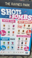
There’s a sign outside a high-street pub which is a minute’s stroll from Allen Carr’s Worldwide HQ in Raynes Park, London. I walk past it every morning on my way from the train station. Every time I do so it seems to bother me a little more. I think it’s the indiscriminate nature of the advert. It’s on an A-board right on the high street opposite the railway station which is used by nearly 11,000 people (including kids) each day. Not to mention the hundreds of local kids that walk past the sign each and every day on their way to and from school.The Hi-Viz colors and pop art splashes scream “This stuff is cool!”
There’s something entirely indiscriminate about the way the sign just sits there, day in, day out shouting it’s luminous, almost “Hi-Viz” message to anyone going about their daily business. And what a message it is; “Bomb Bar”, “Flavoured Shots”, “Hot Shots”, and “Sharp Shooters” with menu items such as “Glitter Bomb”, “Fire Bomb”, “Jack Daniel’s Tennessee Fire”, and “Smirnoff Gold” that scream ‘aspirational branding’ as well as the seemingly harmless, almost fresh and healthy sounding “Apple”, “Cherry”, “Mango”, and “Tropical” shots. Look at those colors, and the way they’re splashed in an almost pop art fashion across the poster.What’s the message? “Get cheap booze here!”
All that aside, the pricing is aggressively pitched at the buying of rounds of 2, 4, or 5 and shouts ‘cheap booze’. The message is clear, come in, drink as much as you can, as fast as you can. It makes a mockery of the snazzy little logo, squeezed in at the bottom of the poster saying “ENJOY RESPONSIBLY”. It’s surely not coincidental that the only part of the logo that is actually readable to the passer-by is “ENJOY”. Because it is written in large letters. And “RESPONSIBLY” is written small. What message is it that you think the booze companies are trying to convey? So much for the ‘DrinkAware’ campaigns that seemingly approve of such ‘manipulation’ of font size in its warning messaging in order to deliberately deliver the exact opposite “message” than that which is implied by the text alone.Read more about ‘How to Quit Drinking’ with Allen Carr’s Easyway
Visit the booze-industry-funded ‘DrinkAware’ Website
#QuitAlcohol #StopDrinking #BeAddictionFree #AllenCarr
From the desk of John Dicey, Worldwide CEO & Senior Facilitator, Allen Carr’s Easyway